As a professional photographer, your website is one of your most important tool. It is your show room, your potential customers will take a look on this portfolio before taking their decision to work with you or not.
This is one of the most scalable way to be discovered by new customer. This is your online branding and the first impression you’ll give to your clients.
Improving your website is primordial since it will help you to get more customers, to be more professional and build trust with your future clients.
As an entrepreneur in the web industry, here are my 5 biggest tips to improve your professional photography website.
1. Mobility
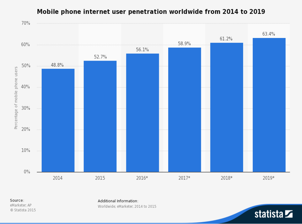
 As you can see, smartphones and tablets are everywhere. More than 50% of the internet traffic is on mobile devices and it’s only the beginning.
There is a big chance that your customers will see your website on their smartphone or tablet.
As this is your personal branding, it’s very important to have your website optimized for mobile devices.
Would you like to visit a website where you can’t read all the text or where the images are cut in the middle? I’m sure, you won’t :-)
Besides Google has recently announced that they promote the websites that are optimized for mobile devices in their algorithm, which means you will appear higher…
- Use responsive templates (in case your website is built with Wordpress or any other CMS for example)
- Use Platforms: if you are not an expert. All the current platforms to develop a website have responsive templates since it is one of the biggest revolutions in the web industry for the past 10 years.
- Don’t use heavy element (like high resolution images) that will take a lot of time to load. Mobile devices haven’t always good internet connection and little memory.
- In case you decide to customize the CSS, don’t use fixed margin, size or element but rather use a percentage size instead.
2. Rapidity
 With internet the quantity of information we have has expanded a lot. We have so much stuff to read, to watch, to do. A lot of people are busy and don’t have enough time to do all they would like.
My favourite things in life don’t cost any money. It’s really clear that the most precious resource we all have is time. - Steve Jobs
You need to have a site that is very fast to load. A lot of users will quite a website if it’s too long to load and will never come back again. What a shame to loose a visitor before they have any chance to see your work.
What would you say, in a restaurant, if you need to wait 1 hour before being seated and 1 hour to get your meal…
Besides the search engines take it in consideration in their algorithms, it’s even more important :-).
- Use small resolution images - you don’t need the high resolution ones, the visitors will not print them and remember that a lot of visitors will be on mobile devices.
- Do not have a lot of images on the same page. The browser will need to load all of them and will be over charged. Either do small galleries or use pagination.
- use Platforms to build your website if you are not an expert. Their work is to improve their software and the speed is usually one of their biggest priority.
3. Easy to use
 Your clients are not always very confident with internet.
Making your site very easy to use with very simple navigation, menu, pages… will allow everybody to enjoy your work and navigate into your website easily.
You don’t need a very sophisticated website. As a photographer, you already have great assets that make your website attractive: Your Images. Make the things simple and you’ll see that people will love your website and find the piece of information they want.
What about the paperwork where you are never able to find the information except by reading 1000 pages of text. Do you like it?
- Easy navigation: Do not use strange navigation (especially between your images).
- Use popular conventions (a vertical scroll is a vertical scroll not a slides how)
- Clear menu
- One idea per page or per section. Do not multiply information, it will confuse your readers
4. SEO
 Your website is one of the most scalable way to get new clients. It is your online visibility. But it’s very hard to be found by new comers since there are tons of photography websites. You need to optimize your website for the search engines (as google), for example by choosing the right keywords.
If you choose “portrait photographer” as keyword, you will be in competition with tons of other portrait photographers. You should use something like “original corporate portrait photographer for start-up”. That’s called long tail keywords and it’s more specific to your business and less competitive.
- Find the keywords your clients will use to find you and use them in the text of your website. You don’t need to use them in the same order… The search engines are smart, trust me ;-)
- Define correctly the titles, headers, images titles, images alt text… (with keywords and it needs to be relevant regarding the content you have on the page)
- Fill the meta datas
- Simplify the social sharing/following
- Be present: Social media, blog, comments, likes…
5. Easy to maintain
 You are a photographer not a web developer. You have already a lot of things to do on the Photography side. You need to save your time to focus on what you are the best at.
It’s better to use tools/platforms that allow you to get a website easily and quickly.
- Don’t try DIY website if you don’t want to take time to work on it.
- Use easy tools and don’t customize too much if you are not ready to go into them.
- Make it simple
- If you have enough budget, you can pay a freelance to build your website. But you need to insist about the maintenance to be able to change a little bit the content if needed.
Feel free to read Top 7 platforms to create your optimized photography website where I give you an overview of the best platforms to create your photography website.